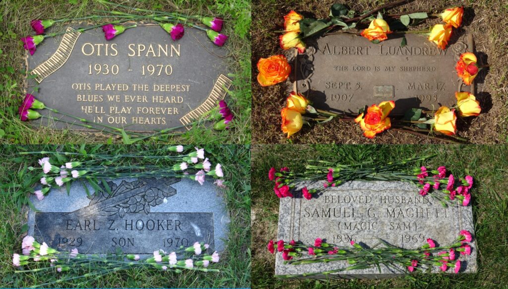
Over the summer, I wrote a book called: Flowers For Chicago Blues: A Grave Tour. Recently, I turned the book into a website: https://chicagobluesgravetour.com
Flowers For Chicago Blues, which has yet to be published, honors twenty-one of the greatest Blues artists buried in the Chicagoland area. The reader travels through eleven cemeteries. Each set of carnations and roses were placed upon the graves by me. They are coordinated to fit the artist’s style. The website consists of 33 HTML pages, 38 JPG images, a CSS page, and JavaScript. The book/website is a culmination of the last seven years of studying Chicago Blues and visiting these artists gravesites. My intention with the website is to show how these artists shaped and molded American Popular Music as we know it today.
The aesthetic design for the website, although very simple looking, took a lot of time to conceive. Once I was able to complete the homepage with the black background and centered grave image, the rest became easier. I spent hours creating homepages with different cemeteries for the background. After eight hours of discontent and multiple failed designs, I realized an all-black background would work best. It allows for flowers and gravestone colors to blend and pop.
I colored the buttons purple, as they blend with the black background and pop with Otis Spann’s purple carnation filled gravestone. His grave is my personal favorite and was very tricky to find. Another favorite of mine is John Belushi’s cenotaph with yellow roses. The colors really pop, and it reminds me of his SNL Bumble Bee sketch which spawned The Blues Brothers act.
I used Papyrus font as it has a real grave like feel through the text. JavaScript creates the delay image effect on Muddy Waters’ and John Belushi’s pages. When the user finishes the tour, a pop-up message appears asking the user if they want to restart the tour.
Web development wise, I learned a lot from this web project. When coding HTML, always label your first page index.html. Make sure your JPG images match the text in your HTML page. I learned this the hard way. Initially, I was able to get away with it when I ran the website on my server, but when I uploaded all the files to the hosting companies’ server to make the website public, the images didn’t load. Every detail matters when programming. Your code and image text need to be exact.
gravecollage.jpg
<img src=“gravecollage.jpg”>
The first line is a basic JPG image file. The img tag stands for image and the src attribute points to the image file. Also, make sure each one of your JPG images is under 500 kilobytes in size or within a range. This helps the web page load faster. I initially used large JPG image files and the website loaded and ran slowly. Lesson learned.
Centering images and text is crucial in web design. CSS is a stylesheet language that styles HTML tags. Below is the CSS code to center the grave homepage image.
img {display: block;
width: 97%;
margin: auto;
height: auto;}
The img tag is naturally an inline-block tag and not a block level tag. This means it doesn’t span the width of the whole screen. To change this, I displayed it as a block level tag. When centering the image, it will now use the entire width of the screen. I made the width of the image smaller by 3%. The margin auto code centers the image as it automatically adjusts to the viewport around it. This was also done with the height. Another important CSS property is text-align. When set to center, it centers text.
Media Queries allow your website to look good on different device sizes. Think of your iPhone, iPad, and iMac. Every screen has a different size. If you look at the Chicago Blues Grave Tour website on an iPhone, you will notice the homepage picture has less margin on the left and right side versus a desktop computer. The code below alters the websites style when a device is greater than 1000 pixels in width. For reference, iPhones are less than 500 pixels in width.
@media all and (min-width: 1000px) {
img {display: block;
width: 68%;
margin: auto;
height: auto;}
Notice that the width is set to 68%. I made the image smaller as it didn’t sit correctly on laptops and desktops. This creates more margin space on the left and right side when viewing on a computer screen.
Computer programming and especially web development is a constant battle of making sure your code works and does exactly what you want it to. Creating a new website is always a learning experience. If you can learn a few new things every project, that is a major win. It reminds me of music. I have been playing guitar for over twenty years and there is still so much to learn.
The Chicago Bluesman I call the big four: Muddy Waters, Jimmy Reed, Big Bill Broonzy, and Howlin’ Wolf gave birth to Eric Clapton, Jimmy Page, Buddy Guy, Keith Richards & Mick Jagger of The Rolling Stones, The Beatles, Bob Dylan, Jack White, John Mayer, and everyone else imaginable.

